mplpub
mplpub is a simple python module that provides a number of templates for publication quality matplotlib figures. It can be installed using pip as follows:
python3 -m pip mplpub
For maximum plot quality and flexibility when including mathematical equations, mplpub uses your system’s LaTeX distribution to render labels etc. Thus you will need a working LaTeX distribution, and the helvet LaTeX package which is used to render all text and math using Helvetica. This package in typically shipped with comprehensive LaTeX distributions, e.g., TeXLive.
Templates
Currently the following templates are available:
acs
acs_dcol
base
base_2.0_update
jpcl_toc
natcom
natcom_dcol
phd
phd_fw
rsc
rsc_dcol
Upper-case greek letters
Upper-case greek letters are generally not available when using sans-family fonts such as Helvetica.
In this case, one can often get acceptable results by falling back to a serif font.
In mplpub this has been conveniently implemented as a LaTeX command called \UG that can be invoked in you LaTeX-containing python strings like so:
r"Upper-case greek letters: $\UG{\Delta}$"
Commands
- mplpub.setup(tex=True, template=None, width=None, height=None, font_family='sans-serif', color_cycle=odict_values(['#1F77B4', '#FF7F0E', '#2CA02C', '#D62728', '#9467BD', '#8C564B', '#E377C2', '#7F7F7F', '#BCBD22', '#17BECF', '#AEC7E8', '#FFBB78', '#98DF8A', '#FF9896', '#C5B0D5', '#C49C94', '#F7B6D2', '#C7C7C7', '#DBDB8D', '#9EDAE5']), extra_settings=None)[source]
Set up publication quality plotting by changing the
rcparamsdictionary and various other options.
Examples
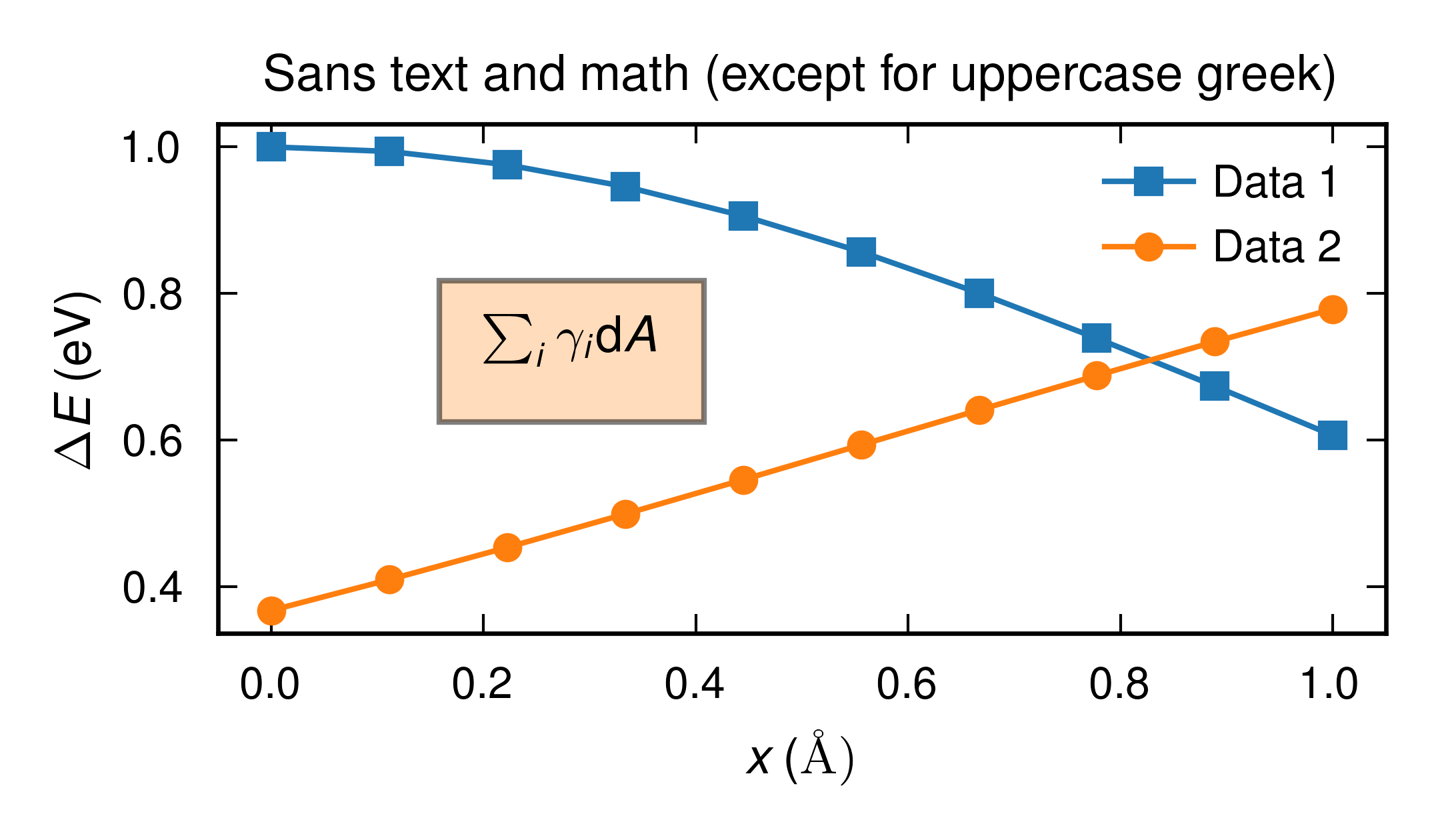
A simple plot showcasing the basic features of the mplpub plotter.
Source code:
import numpy as np
import matplotlib.pyplot as plt
import mplpub

# setup for publication quality plotting using default options,
# plot labels etc. will be rendedred by system LaTeX using a Helvetica
# sans-serif font
mplpub.setup(height=2.1, width=3.6)

# plot something
x = np.linspace(0, 1, 10)
y1 = np.exp(-x**2/2.0)
y2 = np.exp(-(x-2)**2/4.0)

fig, ax = plt.subplots()
ax.plot(x, y1, marker='s', label='Data 1')
ax.plot(x, y2, marker='o', label='Data 2')

# generally for latex we need an r before the string to not
# interpret backslash as an escape sequence
# also note that mplpub automatically loads amsmath so we can
# use the \text command
ax.set_xlabel(r'$x \,\text{(\normalfont\AA)}$')

# Glyphs for upper case greek letters are typically not included in sans fonts
# so to get them the mplpub module employs a dirty hack where we temporarily
# fall back to a serif font, this is handled automatically
# by the custom UG command:
ax.set_ylabel(r'$\UG{\Delta}E \,(\text{eV})$')

# the module comes with nice colors saved in dictionaries, the default
# colors are taken from the tableau palette but can also be accessed
# through a dictionary
ax.text(0.2, 0.7, r'$\sum_i\gamma_i\mathrm{d}A$',
        bbox={'facecolor': mplpub.tableau['lightorange'], 'alpha': 0.5, 'pad': 8})

ax.set_title(r'Sans text and math (except for uppercase greek)')
ax.legend()  # legends are automatically located at the "best" position

plt.tight_layout()
plt.savefig('example_basic.png')
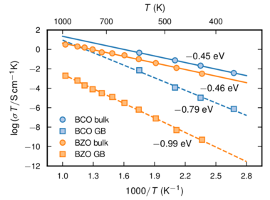
A plot with different x scales (and labels) at the top and bottom.
Source code:
import numpy as np
import matplotlib.pyplot as plt
import mplpub

###################################################################
# Data
###################################################################
# BaCeO3 data - Bassano et. al., Solid State Ionics 180, 168 (2009):
# fig 8, 1250 C-data
T_inv_bco = np.array([1.75, 2.1, 2.35, 2.675])  # 1000/T in Kelvin
T_bco = 1000.0 / T_inv_bco  # T in Kelvin
log_s_b_bco = np.array([-3.1, -3.8, -4.3, -5.0])  # log(sigma_bulk)
log_s_gb_bco = np.array([-4.9, -6.6, -7.6, -8.7])  # log(sigma_gb)
log_sT_b_bco = np.log10(10**(log_s_b_bco) * T_bco)  # log(sigma_bulk * T)
log_sT_gb_bco = np.log10(10**(log_s_gb_bco) * T_bco)  # log(sigma_gb * T)

# BaZrO3 data - Shirpour et. al., PCCP 14, 730 (2012): Fig 9, 6YBZ-data
T_bzo = 273 + np.array([150, 200, 250, 300, 350, 400,
                        450, 500, 550, 600, 700])  # T in Kelvin
T_inv_bzo = 1000.0 / T_bzo  # 1000/T in Kelvin
log_sT_b_bzo = np.array([-2.5, -1.9, -1.4, -1.0, -0.6, -0.4,
                         -0.3, 0.0, 0.2, 0.3, 0.5])  # log(sigma_bulk * T)
log_sT_gb_bzo = np.array([-9.3, -8.3, -7.1, -6.2, -5.5, -4.9,
                          -4.5, -4.1, -3.7, -3.2, -2.7])  # log(sigma_gb * T)

# Fits to data points
b_fit_bco = np.polyfit(T_inv_bco, log_sT_b_bco, 1)
gb_fit_bco = np.polyfit(T_inv_bco, log_sT_gb_bco, 1)
b_fit_bzo = np.polyfit(T_inv_bzo, log_sT_b_bzo, 1)
gb_fit_bzo = np.polyfit(T_inv_bzo, log_sT_gb_bzo, 1)

temp_inv = np.linspace(1, 2.8, 181)
line_b_bco = b_fit_bco[0] * temp_inv + b_fit_bco[1]
line_gb_bco = gb_fit_bco[0] * temp_inv + gb_fit_bco[1]
line_b_bzo = b_fit_bzo[0] * temp_inv + b_fit_bzo[1]
line_gb_bzo = gb_fit_bzo[0] * temp_inv + gb_fit_bzo[1]

###################################################################
# Plot settings
###################################################################
# Setup for publication quality plotting using ACS (American Chemical
# Society) template with a non-default option for figure height
mplpub.setup(template='acs', height=2.4)

# X and Y label strings
x_label_string1 = r'$1000/T$ ($\text{K}^{-1}$)'
x_label_string2 = r'$T$ (K)'
y_label_string = r'$\log{(\sigma T / \text{S}\,\text{cm}^{-1}\text{K})}$'

# X and Y tick postions
xmin = 1.0
xmax = 2.8
dx = 0.3
ddx = 0.15
nx = int(round((xmax - xmin) / dx) + 1)
x_tick_values1 = xmin + dx * np.array(range(nx))

x_tick_values2 = np.array([400, 500, 700, 1000])
x_tick_positions2 = 1000.0 / x_tick_values2

ymin = -12
ymax = 2
dy = 2
ddy = 0
ny = int(round((ymax - ymin) / dy) + 1)
y_tick_values = ymin + dy * np.array(range(ny))

###################################################################
# Plot figure
###################################################################
fig, ax1 = plt.subplots()
ax1.plot(temp_inv, line_b_bco, '-', color=mplpub.tableau['blue'])
ax1.plot(temp_inv, line_gb_bco, '--', color=mplpub.tableau['blue'])
ax1.plot(temp_inv, line_b_bzo, '-', color=mplpub.tableau['orange'])
ax1.plot(temp_inv, line_gb_bzo, '--', color=mplpub.tableau['orange'])
ax1.plot(
    T_inv_bco,
    log_sT_b_bco,
    'o',
    markeredgecolor=mplpub.tableau['blue'],
    markerfacecolor=mplpub.tableau['lightblue'],
    label=r'BCO bulk')
ax1.plot(
    T_inv_bco,
    log_sT_gb_bco,
    's',
    markeredgecolor=mplpub.tableau['blue'],
    markerfacecolor=mplpub.tableau['lightblue'],
    label=r'BCO GB')
ax1.plot(
    T_inv_bzo,
    log_sT_b_bzo,
    'o',
    markeredgecolor=mplpub.tableau['orange'],
    markerfacecolor=mplpub.tableau['lightorange'],
    label=r'BZO bulk')
ax1.plot(
    T_inv_bzo,
    log_sT_gb_bzo,
    's',
    markeredgecolor=mplpub.tableau['orange'],
    markerfacecolor=mplpub.tableau['lightorange'],
    label=r'BZO GB')

# Sets the x- and y-scales
ax1.set_xlim([xmin - ddx, xmax + ddx])
ax1.set_ylim([ymin - ddy, ymax + ddy])
ax1.set_xlabel(x_label_string1)
ax1.set_ylabel(y_label_string)
ax1.set_xticks(x_tick_values1)
ax1.set_yticks(y_tick_values)

# Sets the top x-scale
ax2 = ax1.twiny()
ax1.xaxis.set_ticks_position('bottom')
ax2.xaxis.set_ticks_position('top')
ax2.axes.set_xticks(x_tick_positions2)
ax2.axes.set_xticklabels(x_tick_values2, position=(0, 0.98))
ax2.set_xlim([xmin - ddx, xmax + ddx])
ax2.set_xlabel(x_label_string2, labelpad=6.4)

ax1.legend()  # legends are automatically located at the "best" position

ax1.text(2.20, -01.0, r'$-$0.45 eV', fontsize=8)
ax1.text(2.34, -04.3, r'$-$0.46 eV', fontsize=8)
ax1.text(2.09, -06.5, r'$-$0.79 eV', fontsize=8)
ax1.text(1.88, -10.0, r'$-$0.99 eV', fontsize=8)

# Adjust figure to remove white space at edges. Can be used even without
# subplots.
plt.subplots_adjust(left=0.175, bottom=0.17, right=0.97, top=0.85)

plt.savefig('example_multiple_xscales.pdf')
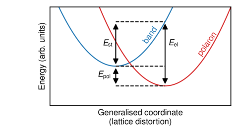
A schematic plot with no ticks or quantitative data.
Source code:
import numpy as np
import matplotlib.pyplot as plt
import mplpub

# Schematic illustration without ticks or other quantitative data
# Contributed by Erik Jedvik

mplpub.setup()

x = np.arange(0.0, 1.2, 0.01)
band = 5*(x - 0.4)**2 + 0.4
pol = 5*(x - 0.7)**2 + 0.2

fig, ax = plt.subplots()

ax.plot(x, band)
ax.plot(x, pol, color=mplpub.tableau['red'])
ax.plot([0.4, 0.7], [0.2, 0.2], '--k')
ax.plot([0.4, 0.7], [0.4, 0.4], '--k')
ax.plot([0.4, 0.7], [0.85, 0.85], '--k')

ax.set_xlabel('Generalised coordinate\n(lattice distortion)')
ax.set_ylabel('Energy (arb. units)')
ax.set_xlim([0.0, 1.1])
ax.set_ylim([0.0, 1.0])

# remove ticks and tick labels, the tick_params method will
# provide you with the most control
ax.tick_params(axis='both',  # which axex to operate on
               which='both',  # operate on both major and minor ticks
               bottom=False,  # turn bottom ticks off
               top=False,
               left=False,
               right=False,
               labelbottom=False,  # turns bottom ticklabels off
               labelleft=False)
# an quicker way with little room for customization
# ax.set_xticks([])
# ax.set_yticks([])

# now we annotate the schematic figure with some helpful text
ax.text(0.56, 0.75, 'band', rotation=55, color=mplpub.tableau['blue'])
ax.text(0.89, 0.70, 'polaron', rotation=55, color=mplpub.tableau['red'])
ax.text(0.29, 0.28, r'$E_\text{pol}$')
ax.text(0.32, 0.6, r'$E_\text{st}$')
ax.text(0.72, 0.6, r'$E_\text{el}$')
ax.annotate('', xy=(0.4, 0.2), xycoords='data',
            xytext=(0.4, 0.4), textcoords='data',
            size=12, va='center', ha='center',
            arrowprops=dict(arrowstyle='<|-|>',
                            connectionstyle='arc3, rad=0',
                            fc='k')
            )
ax.annotate('', xy=(0.4, 0.4), xycoords='data',
            xytext=(0.4, 0.85), textcoords='data',
            size=12, va='center', ha='center',
            arrowprops=dict(arrowstyle='<|-|>',
                            connectionstyle='arc3, rad=0',
                            fc='k')
            )
ax.annotate('', xy=(0.7, 0.2), xycoords='data',
            xytext=(0.7, 0.85), textcoords='data',
            size=12, va='center', ha='center',
            arrowprops=dict(arrowstyle='<|-|>',
                            connectionstyle='arc3, rad=0',
                            fc='k')
            )

plt.subplots_adjust(left=0.21, bottom=0.24,
                    right=0.97, top=0.95,
                    wspace=0.15, hspace=0.10)
plt.savefig('example_schematic.pdf')
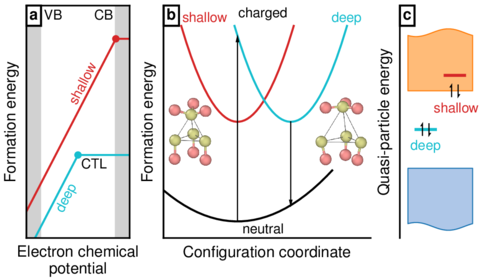
A fancy schematic figure that includes png insets (from OVITO in this case).
Source code:
#!/usr/bin/env python

import numpy as np
import matplotlib.pyplot as plt
import matplotlib.gridspec as gridspec
from matplotlib.offsetbox import OffsetImage, AnnotationBbox
from matplotlib._png import read_png
import mplpub

# Set figure specs
mplpub.setup(template='natcom', height=2.0)
fig = plt.figure()
gs = gridspec.GridSpec(1, 100)
ax1 = plt.subplot(gs[0, 2:24])
ax2 = plt.subplot(gs[0, 31:75])
ax3 = plt.subplot(gs[0, 81:100])
fig.subplots_adjust(left=0.035, bottom=0.15, right=1.01, top=0.98)

###################################################################
# sub figure 1
###################################################################

# Data to plot
mue = np.linspace(0, 3, 31)
s = 0.8 + 2 * mue
d = -0.5 + 2 * mue
ctl_s = 26
ctl_d = 15
s[ctl_s + 1:] = s[ctl_s]
d[ctl_d + 1:] = d[ctl_d]
be = 0.4

# plot settings
xmin = -0
xmax = 3
ymin = 0
ymax = 7

# plot data
ax1.plot(mue, d, '-', color=mplpub.tableau['turquoise'])
ax1.plot(mue, s, '-', color=mplpub.tableau['red'])
ax1.plot(
    mue[ctl_d],
    d[ctl_d],
    'o',
    markersize=3,
    markerfacecolor=mplpub.tableau['turquoise'],
    markeredgecolor=mplpub.tableau['turquoise'],
)
ax1.plot(
    mue[ctl_s],
    s[ctl_s],
    'o',
    markersize=3,
    markerfacecolor=mplpub.tableau['red'],
    markeredgecolor=mplpub.tableau['red'],
)

# grey shaded areas
ax1.fill_betweenx(
    [ymin, ymax],
    xmin,
    xmin + be,
    edgecolor=mplpub.tableau['lightgrey'],
    facecolor=mplpub.tableau['lightgrey'],
)
ax1.fill_betweenx(
    [ymin, ymax],
    xmax - be,
    xmax,
    edgecolor=mplpub.tableau['lightgrey'],
    facecolor=mplpub.tableau['lightgrey'],
)

# set x- and y-limits
ax1.set_xlim([xmin, xmax])
ax1.set_ylim([ymin, ymax])

# remove x- and y-ticks
ax1.set_xticks([])
ax1.set_yticks([])

# set axis labels
ax1.set_xlabel('Electron chemical\n potential')
ax1.set_ylabel('Formation energy')

# text pieces. the transform argument yields fractional coordinates
# for the text positions, which is very convenient.
ax1.text(0.17, 0.94, 'VB', transform=ax1.transAxes, fontsize=7)
ax1.text(0.84, 0.94, 'CB', transform=ax1.transAxes, fontsize=7, ha='right')
ax1.text(
    0.40,
    0.72,
    'shallow',
    transform=ax1.transAxes,
    fontsize=7,
    rotation=63,
    color=mplpub.tableau['red'],
)
ax1.text(
    0.27,
    0.20,
    'deep',
    transform=ax1.transAxes,
    fontsize=7,
    rotation=63,
    color=mplpub.tableau['turquoise'],
)
ax1.text(0.53, 0.30, 'CTL', transform=ax1.transAxes, fontsize=7)
ax1.text(
    0.03,
    0.94,
    r'\textbf{a}',
    transform=ax1.transAxes,
    bbox={'facecolor': 'white', 'alpha': 1, 'pad': 1.5, 'linewidth': 1},
)

###################################################################
# sub figure 2
###################################################################

# Data to plot
y_d_n_x0 = 2.5
y_d_n_y0 = 0.5
y_d_c_x0 = 4.3
y_d_c_y0 = 3.5
nbr_gridpoints = 701
x_range = np.linspace(0, 7, nbr_gridpoints)
y_d_n = y_d_n_y0 + 0.15 * (x_range - y_d_n_x0) ** 2
y_d_c = y_d_c_y0 + 0.80 * (x_range - y_d_c_x0) ** 2
y_s_c = y_d_c_y0 + 0.80 * (x_range - y_d_n_x0) ** 2

# plot settings
xmin = 0
xmax = 7
ymin = 0
ymax = 7

# plot data
ax2.plot(x_range[60:441], y_s_c[60:441], '-', color=mplpub.tableau['red'])
ax2.plot(x_range[0:571], y_d_n[0:571], '-k')
ax2.plot(x_range[240:621], y_d_c[240:621], '-', color=mplpub.tableau['turquoise'])

# set x- and y-limits
ax2.set_xlim([xmin, xmax])
ax2.set_ylim([ymin, ymax])

# remove x- and y-ticks
ax2.set_xticks([])
ax2.set_yticks([])

# set axis labels
ax2.set_xlabel('Configuration coordinate')
ax2.set_ylabel('Formation energy')

# remove borders
ax2.spines['right'].set_visible(False)
ax2.spines['top'].set_visible(False)

# text pieces. the transform argument yields fractional coordinates
# for the text positions, which is very convenient.
ax2.text(0.48, 0.02, 'neutral', transform=ax2.transAxes, fontsize=7, ha='center')
ax2.text(0.48, 0.95, 'charged', transform=ax2.transAxes, fontsize=7, ha='center')
ax2.text(
    0.09,
    0.93,
    'shallow',
    transform=ax2.transAxes,
    fontsize=7,
    color=mplpub.tableau['red'],
)
ax2.text(
    0.81,
    0.93,
    'deep',
    transform=ax2.transAxes,
    fontsize=7,
    color=mplpub.tableau['turquoise'],
)
ax2.text(
    0.015,
    0.94,
    r'\textbf{b}',
    transform=ax2.transAxes,
    bbox={'facecolor': 'white', 'alpha': 1, 'pad': 1.5, 'linewidth': 1},
)

# arrows
arrow_head_width = 0.08
arrow_head_length = 0.15
ax2.arrow(
    y_d_c_x0,
    y_d_c_y0,
    0,
    y_d_n[431] - y_d_c_y0,
    head_width=arrow_head_width,
    head_length=arrow_head_length,
    length_includes_head=True,
    fc='k',
    ec='k',
    zorder=20,
    linewidth=0.5,
)
ax2.arrow(
    y_d_n_x0,
    y_d_n_y0,
    0,
    y_d_c[251] - y_d_n_y0,
    head_width=arrow_head_width,
    head_length=arrow_head_length,
    length_includes_head=True,
    fc='k',
    ec='k',
    zorder=20,
    linewidth=0.5,
)

# embedd png images
arr_neutral = read_png('example_fancy_schematic_embedded_png_fig1.png')
imagebox = OffsetImage(arr_neutral, zoom=0.105)
ab = AnnotationBbox(imagebox, [0.9, 3.2], frameon=False)
ax2.add_artist(ab)
arr_neutral = read_png('example_fancy_schematic_embedded_png_fig2.png')
imagebox = OffsetImage(arr_neutral, zoom=0.105)
ab = AnnotationBbox(imagebox, [6.0, 3.2], frameon=False)
ax2.add_artist(ab)

###################################################################
# sub figure 3
###################################################################

# Data to plot
ctl_d = [0.75, 1.35]
ctl_s = [1.65, 2.25]
xstart = 0.5
xend = 2.5
nbr_gridpoints = 1001
x_range = np.linspace(xstart, xend, nbr_gridpoints)
y_min_range = 0.5 - 0.1 * np.sin(np.pi / 4.0 + 2 * np.pi * x_range / (xstart - xend))
y_max_range = 5.5 + 0.1 * np.sin(np.pi / 4.0 + 2 * np.pi * x_range / (xstart - xend))

# plot settings
xmin = 0.25
xmax = 3.0
ymin = 0.2
ymax = 6.2

# plot valence (blue) and conduction (orange) bands as filled regions
ax3.fill_between(
    x_range,
    y_min_range,
    2.0,
    edgecolor=mplpub.tableau['blue'],
    facecolor=mplpub.tableau['lightblue'],
    linewidth=0.5,
)
ax3.fill_between(
    x_range,
    4.0,
    y_max_range,
    edgecolor=mplpub.tableau['orange'],
    facecolor=mplpub.tableau['lightorange'],
    linewidth=0.5,
)

# plot data
ax3.plot(ctl_d, [3.0, 3.0], '-', color=mplpub.tableau['turquoise'], linewidth=1.5)
ax3.plot(ctl_s, [4.4, 4.4], '-', color=mplpub.tableau['red'], linewidth=1.5)

# set x- and y-limits
ax3.set_xlim([xmin, xmax])
ax3.set_ylim([ymin, ymax])

# remove x- and y-ticks
ax3.set_xticks([])
ax3.set_yticks([])

# set axis labels
ax3.set_ylabel('Quasi-particle energy')

# remove borders
ax3.spines['right'].set_visible(False)
ax3.spines['top'].set_visible(False)
ax3.spines['bottom'].set_visible(False)

# arrows (electrons in defect levels)
arrow_head_width = 0.08
arrow_head_length = 0.05
ax3.arrow(
    0.95,
    2.85,
    0,
    0.3,
    head_width=arrow_head_width,
    head_length=arrow_head_length,
    length_includes_head=True,
    fc='k',
    ec='k',
    zorder=20,
    linewidth=0.5,
    shape='right',
)
ax3.arrow(
    1.15,
    3.15,
    0,
    -0.3,
    head_width=arrow_head_width,
    head_length=arrow_head_length,
    length_includes_head=True,
    fc='k',
    ec='k',
    zorder=20,
    linewidth=0.5,
    shape='right',
)
ax3.arrow(
    1.85,
    3.85,
    0,
    0.3,
    head_width=arrow_head_width,
    head_length=arrow_head_length,
    length_includes_head=True,
    fc='k',
    ec='k',
    zorder=20,
    linewidth=0.5,
    shape='right',
)
ax3.arrow(
    2.05,
    4.15,
    0,
    -0.3,
    head_width=arrow_head_width,
    head_length=arrow_head_length,
    length_includes_head=True,
    fc='k',
    ec='k',
    zorder=20,
    linewidth=0.5,
    shape='right',
)

# text pieces. the transform argument yields fractional coordinates
# for the text positions, which is very convenient.
ax3.text(
    0.380,
    0.54,
    'shallow',
    transform=ax3.transAxes,
    fontsize=7,
    color=mplpub.tableau['red'],
)
ax3.text(
    0.120,
    0.38,
    'deep',
    transform=ax3.transAxes,
    fontsize=7,
    color=mplpub.tableau['turquoise'],
)
ax3.text(
    0.035,
    0.94,
    r'\textbf{c}',
    transform=ax3.transAxes,
    bbox={'facecolor': 'white', 'alpha': 1, 'pad': 1.5, 'linewidth': 1},
)

###################################################################
# save figure to file
###################################################################

fig.savefig('example_fancy_schematic_embedded_png.pdf')